
Redesigning my website
I originally made this website based off an artist's own website I liked, but the layout no longer worked for me.
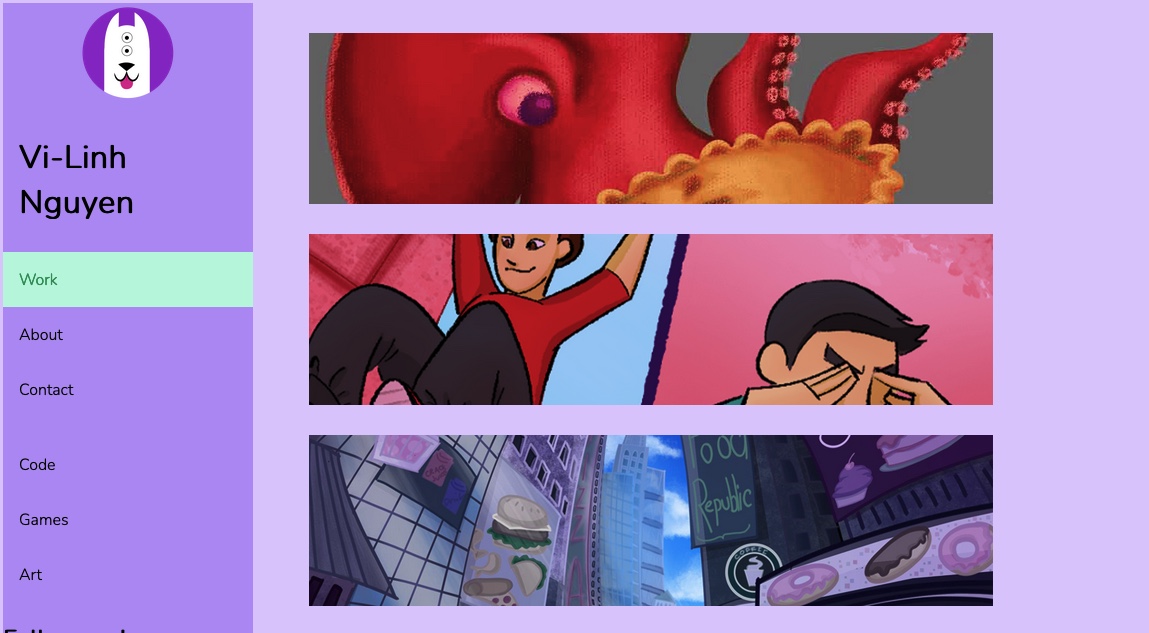
The old website
The layout of my current website was looking outdated, so I decided to update the entire design of it. It would help the visual appeal but also help as an opportunity to practice more frontend development. As I explore more portfolio websites from different industries from animation to web development, I see the common trend of reducing the amount of clicks as possiblefor users interested in seeing what I have to offer. However, I also wish to show people who come to my website, my art. To keep my work organized, I have to categorize.
I decided to only feature a few prominent projects in a grid on the homepage. This way, users could get an idea of what
I can do.
The navigation bar would show the main pages of the website:
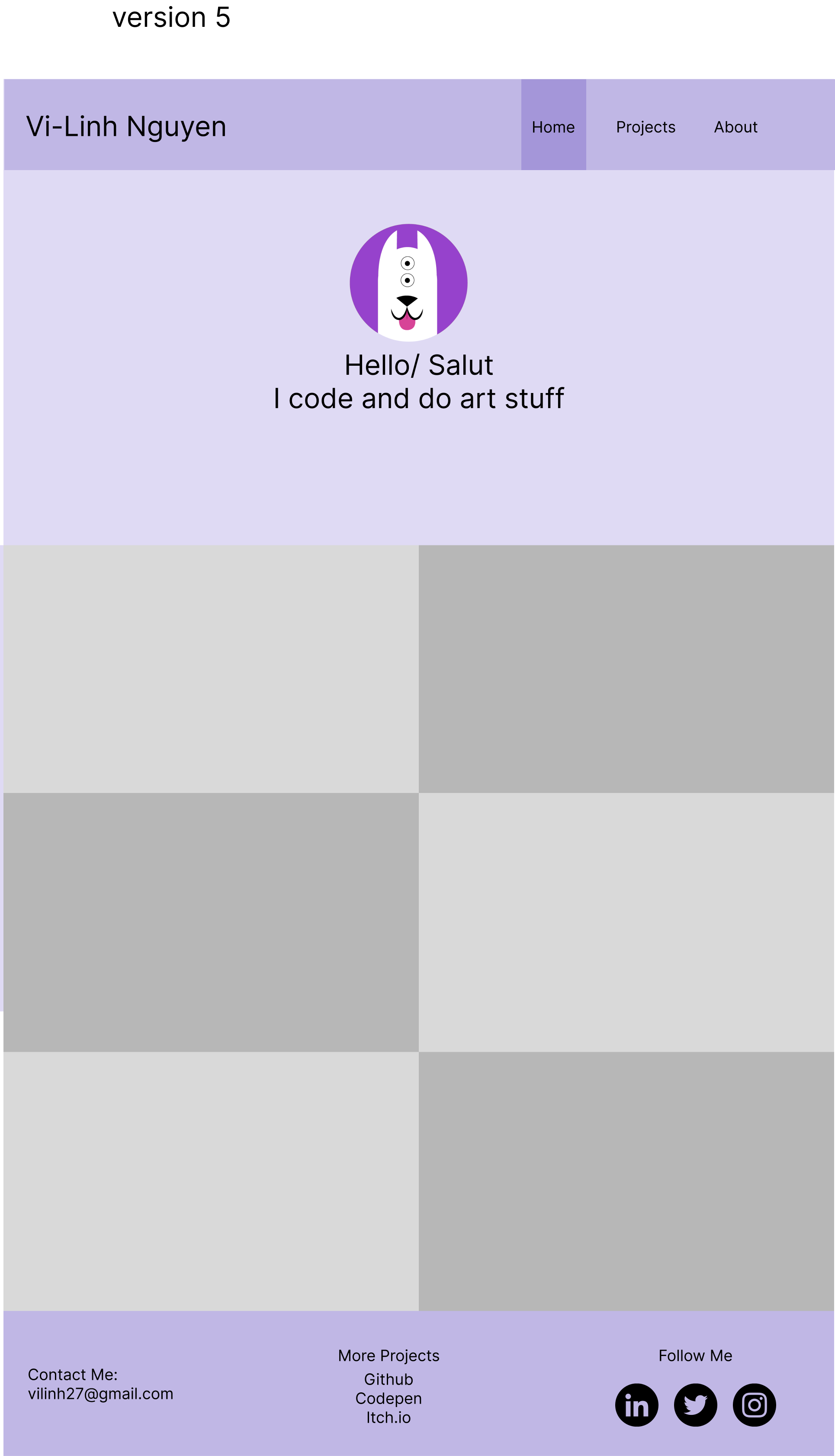
There’s the homepage (what users will first see when they arrive to my website).
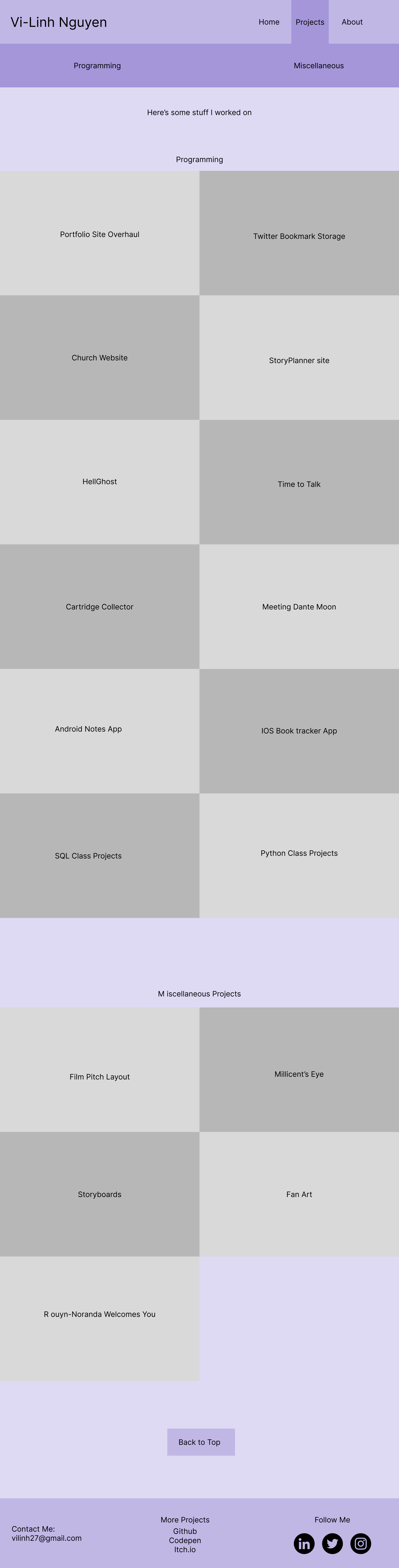
Here is the layout for a more full list of projects I’ve worked on.
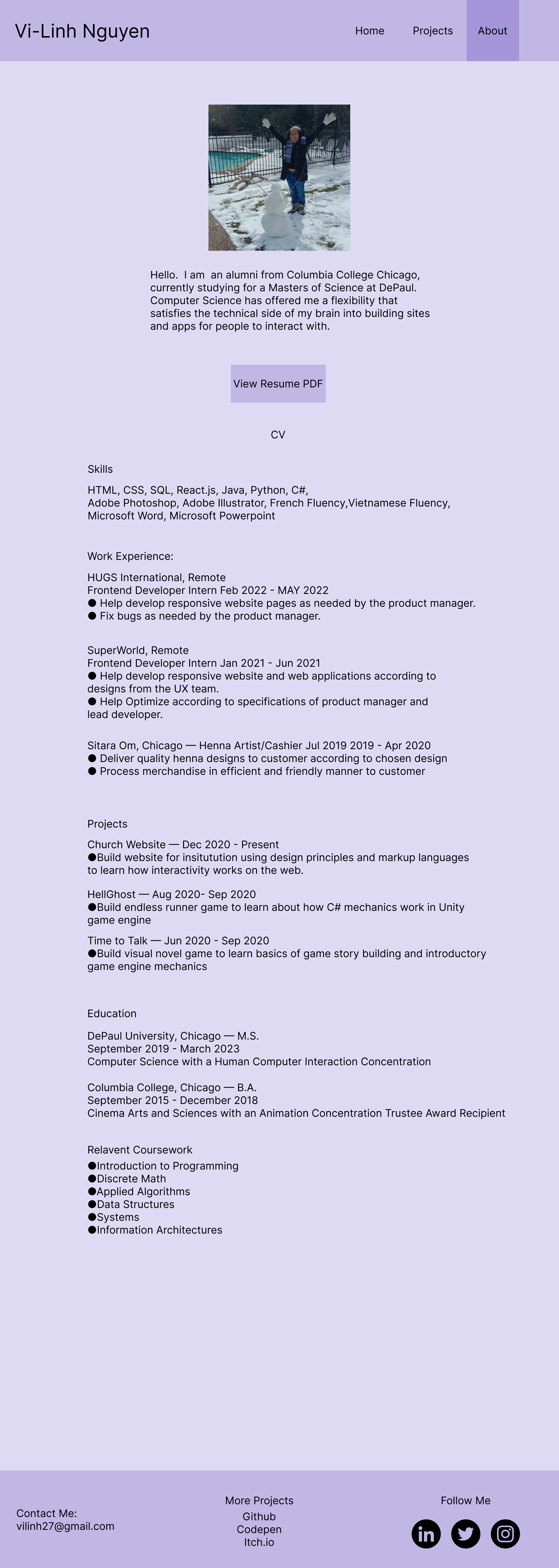
Lastly, I redesigned the page that would allow users a glimpse into who I am, along with a CV.
References
Codepen.io provided some awesome ways to approach text animations to add more pizzazz to this portfolio website. Plus I've learned that a little more interactivity like these text animations can help make the site look a little more professional. I'm still learning how to do this effectively, so there are a lot of people online to thank for the reference.
The translation animation on the homepage header is thanks to this original project by Yoann Helin: here . My version can be seen here where I fiddled with it: here .
The text shuffle decode animation on the project page is thanks to this original project by Ben Raclot. His codepen can be seen here: here .
My version can be seen here where I fiddled with it: here.